Dopamine Design-Part 1
Project/Client Name
Design Case Study-Part 1
Year
2026
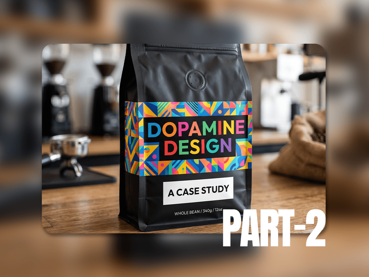
Consumers are tired of beige. This case study tracks the rise of 'Dopamine Design', bold color, expressive type, and tactile textures replacing the safe minimalism that's dominated branding for a decade.
Using real market examples, this study shows how bold, nostalgic color choices drive higher engagement, stronger brand loyalty, and faster shelf recognition than traditional minimalism.
Scope of Work
The Problem: Visual Monotony
For a decade, branding played it safe: sans-serif type, white space, muted palettes. The result? Everything started looking the same causing visual stagnation.
The Pivot: Emotional Resonance
Now brands are going the other way, kinetic layouts, unapologetic color, emotional resonance and evolved brand stories. This isn't decoration. It's how brands survive a crowded market.
Case Study 1: Mirinda (Global Beverage)
The Challenge:
A predictable mass-market soft drink identity that blended quietly into highly competitive carbonated beverage aisles.
The Dopamine Pivot:
A complete visual overhaul built around the platform "Smile Please," featuring an '80s arcade-inspired chunky wordmark and screamingly vibrant color blocks.
The Business Takeaway:
PepsiCo recognized that packaging must act as an instant visual catalyst for spontaneous optimism to capture market share.
Official Perspective: “In a world of busy days and constant noise, sometimes a simple reason to smile can go a long way. Through our new visual identity and Smile Please platform, we are inviting you to pause, refresh and choose a moment of joy.” — Eugene Willemsen, CEO of International Beverages at PepsiCo


Case Study 2: Fix My Curls (Indian Haircare Market)
The Challenge:
Wearing a standard startup uniform of clean, clinical digital beauty that failed to broadcast the high-performance nature of the product line.
The Dopamine Pivot:
Introducing a bold logo structured around the natural "S-shape" of a curl, mapped across an expansive, highly saturated, color-coded packaging system.
The Business Takeaway:
As the niche community scaled to ₹25 crore in revenue, a bold aesthetic update was required to transform a cult favorite into an authoritative, household beauty name.
Official Perspective: “Over the past six years, we've focused relentlessly on product performance, however our visual identity just did not match up to the magic of the experience we were delivering so consistently. Our rebrand is simply a makeover, giving our mission to give curly the zest it needed to move full speed ahead as a category!” — Anshita Mehrotra, Founder of Fix My Curls


Case Study 3: Agua de Madre (UK Wellness & Beverage)
The Challenge:
An understated, low-key probiotic aesthetic that kept the brand confined within the safe, quiet boundaries of the traditional gut-health category.
The Dopamine Pivot:
A masterful act of "visual disobedience." The design clashing high-sensory pulsing tangerines, hot pinks, and overlapping, glossy "sticker-bomb" graphics.
The Business Takeaway:
Breaking category tropes by reframing fermentation not as a clinical health chore, but as a celebratory, flavor-packed soft drink experience.
Official Perspective:
“Most of the research went into understanding the category, and then deliberately avoiding its tropes. Kombucha and gut-health drinks often look relatively minimal. We wanted the opposite: something packed with spirit and colour. The typefaces aren't meant to sit quietly together – they overlap, they compete for space. It's what gives the brand its fizz.”
— Chris Chapman, Creative Director and Lead Designer


Conclusion: The New Visual Mandate
As demonstrated by the strategic pivots of Mirinda, Fix My Curls, and Agua de Madre, the era of minimal aesthetics has officially given way to the "Aesthetics of vibrancy."
The decline of corporate minimalism marks a permanent course correction in global branding. Dopamine design is far more than a fleeting aesthetic trend; it is a powerful tool for business differentiation. In an over-saturated landscape, future-proofing a brand identity requires abandoning uniform constraints, embracing cultural resonance, and daring to inject unmissable personality into every consumer touchpoint.