Dopamine Design-Part 2
Project/Client Name
Design Case Study-Part 2
Year
2026
Part 1 made the case for bold design. Here it is in action. Two conceptual rebrands, one for a mass-market fitness app, one for an artisan coffee brand. Both show how high-vibrancy design can fight screen fatigue and build real brand affinity.
Scope of Work
Prototype 1: Cult.fit — The "Kinetic Joy" Ecosystem
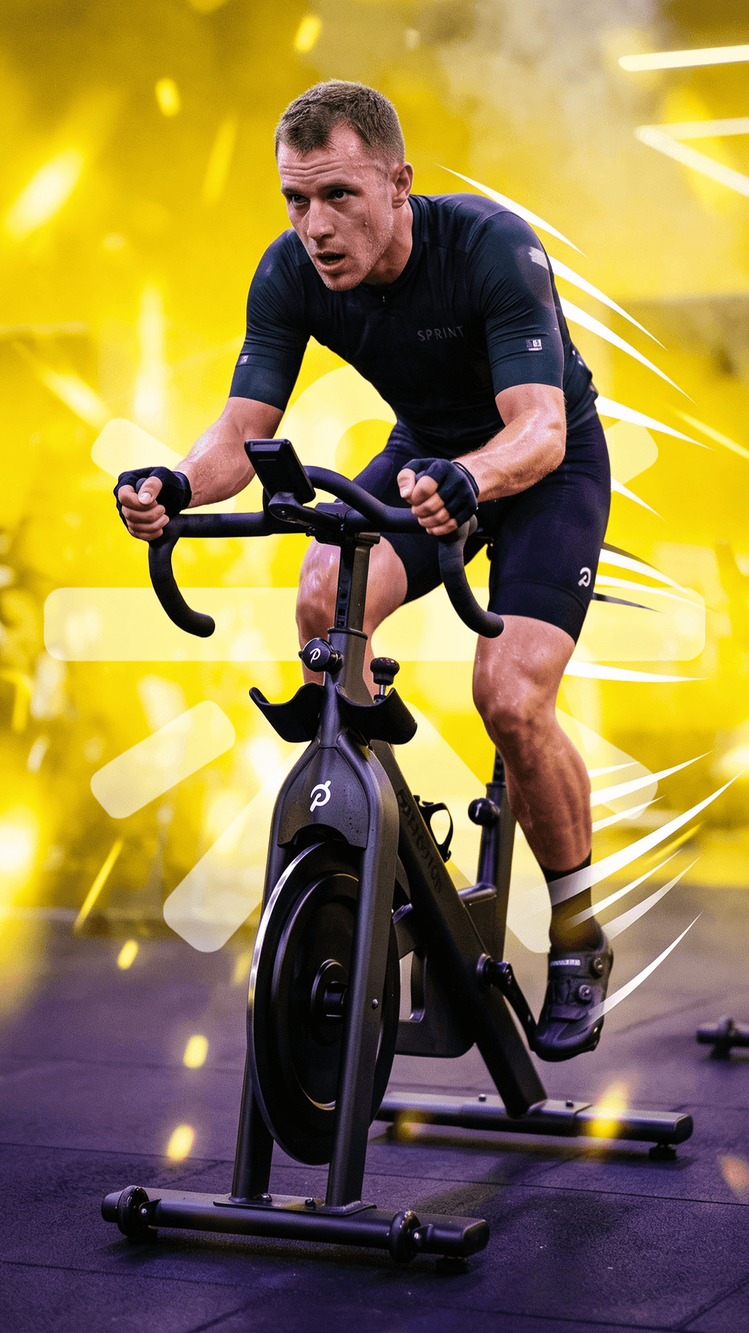
Fitness apps love the 'gym-bro' look, black, gray, harsh neon yellow. Cult.fit's current interface fits that mold: functional, but it makes exercise feel like punishment, which doesn't exactly help with app retention.
Out with punishing dark canvases, in with a deep purple base that adds depth without feeling cold. Psychological Anchors: Yellow for cardio energy, blue for strength training, pink for the calm of yoga and group classes, each color mapped to how that workout actually feels.
By leaning into targeted color psychology, the design transforms a standard fitness application into an inviting, emotionally uplifting daily wellness ritual that actively combats user burnout.




Prototype 2: Half Light Coffee Roasters — The "Sensory Explosion" Concept
Indian specialty coffee has one look: white labels, minimal sans-serif type, craft paper. It signals 'premium', but it also hides everything interesting about what's actually in the bag
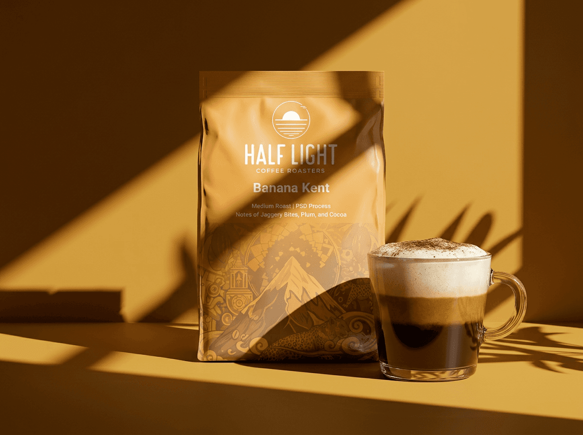
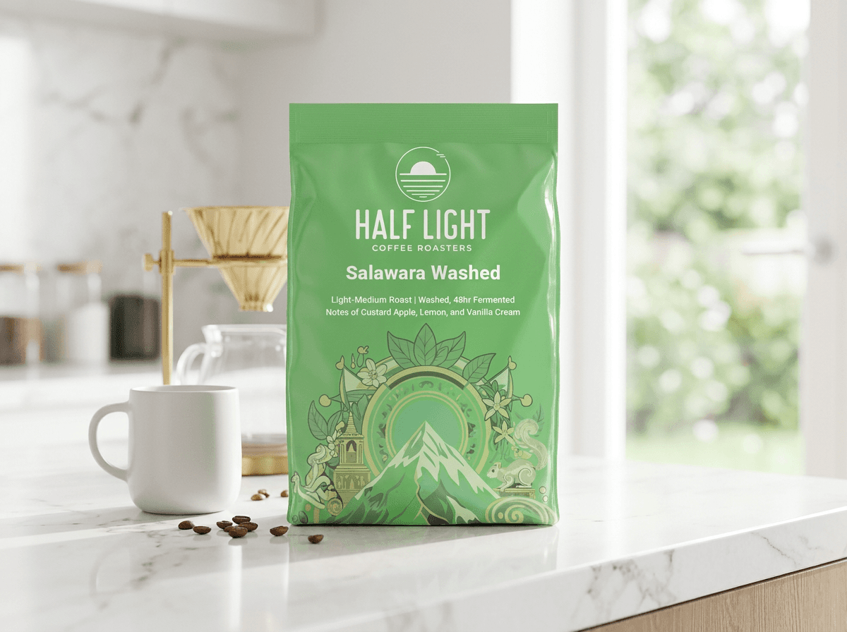
This redesign introduces the concept of Folkloric Terroir, treating product packaging as a live visual translation of origin, geography, and flavor chemistry.
Focusing on three iconic single-origin offerings (Salawara Washed, Banana Kents, and MS Estate), the layout replaces sterile white space with a rich, symmetrical illustration ecosystem.The surrounding flora, indigenous fauna, and underlying color stories alter dynamically to match the specific micro-climate and tasting notes of each harvest.



The Strategic Shift to Maximalism: Cutting Through the Minimalist Noise
This isn't a trend, it's a correction. Whether it's an app interface or a coffee bag, people are choosing brands that feel human over brands that feel safe. In a commoditized market, visual bravery isn't a risk. It's the advantage.



